Wayfinding shouldn’t be stressful.
Ontario is the busiest province in Canada, and with people, comes multiple ways to get around. This is my attempt at simplifying way finding.
UX Design | Way finding
Timeline: August 2022
Tools Used: Adobe Illustrator, Adobe Photoshop
The Challenge
The current Ontario Transit Way Finding system is disjointed across the province, and a real problem leading to consumer confusion. This becomes a bigger issue for residents and tourists at one of Toronto’s busiest locations - The Union Station. Here is an example of the current signage.
Redesigned Ontario Wayfing System
The Ontario Transit Wayfinding Project is rooted in simplification and colour identification. Since all transit system have identifying colours, I decided to use them as the primary differentiator to create an easy to navigate system, that can be adapted beyond the Greater Toronto Area, and serve the whole province. Looking at the four primary services that run in the GTA, Toronto Transit Commission (TTC) logo is the one that hasn’t been updated for the longest time.
Distinctive colours for the 4 province - wide services provides users a clear identification system for all the different services.
Toronto Transit Commission - Red
GO Transit - Green
VIA Rail - Yellow
City/Region Specific Transit - Blue
Strikingly different logos for buses, trains and streetcars prevent confusion.
Depending on available space, GO and VIA wayfinding signage can either use only the logo or the logo and text.

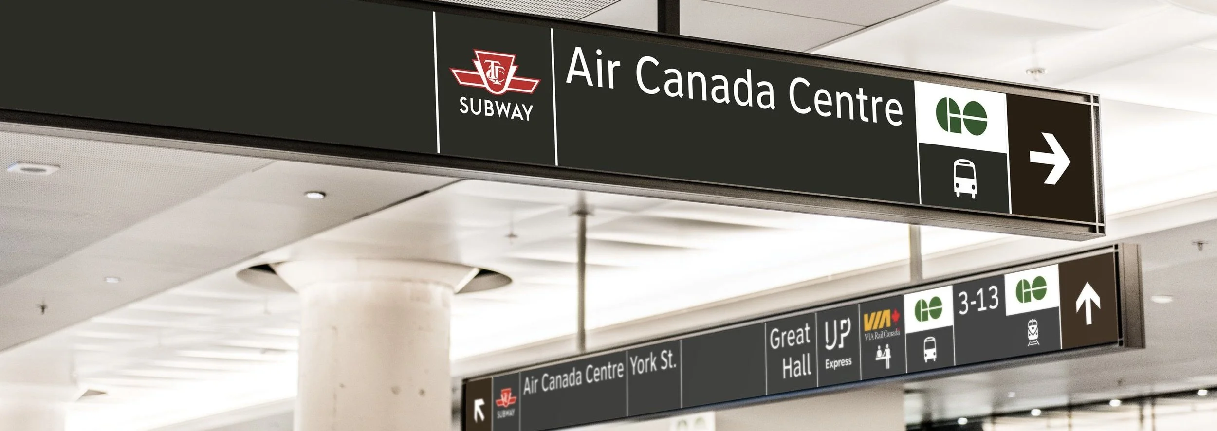
The New Signage
This design implements easily identifiable brand colours on the new way finding signage, and makes it easier to focus on the user’s preferred transport system. It is really lucky that most transport services use different colours for their brands in Ontario, but unfortunately it hasn’t been harnessed to help improve way finding. I believe this design depicts a way these colours can support easier and more efficient way finding.
Union Station

TTC Station


Real World Implementations.
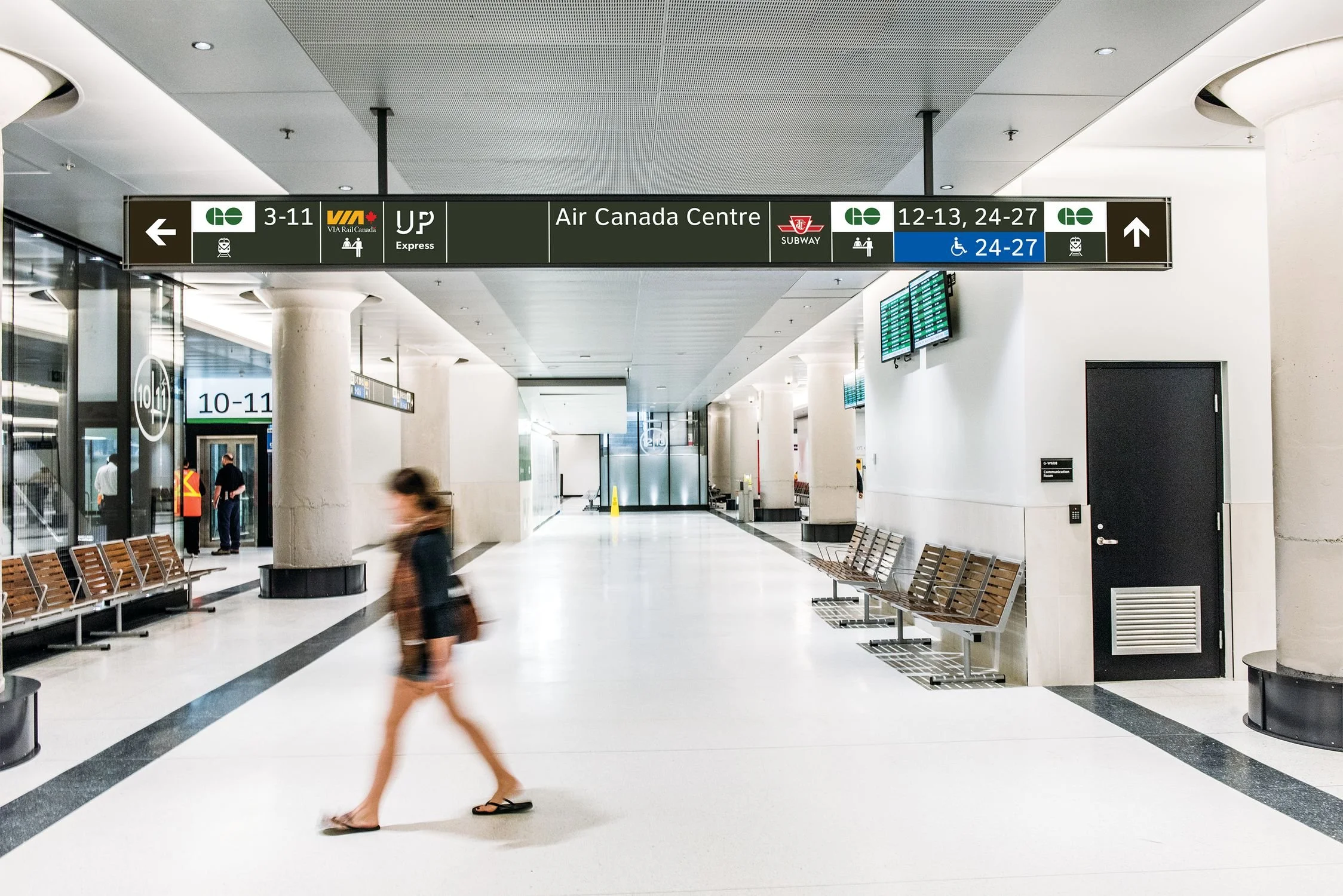
Current

New
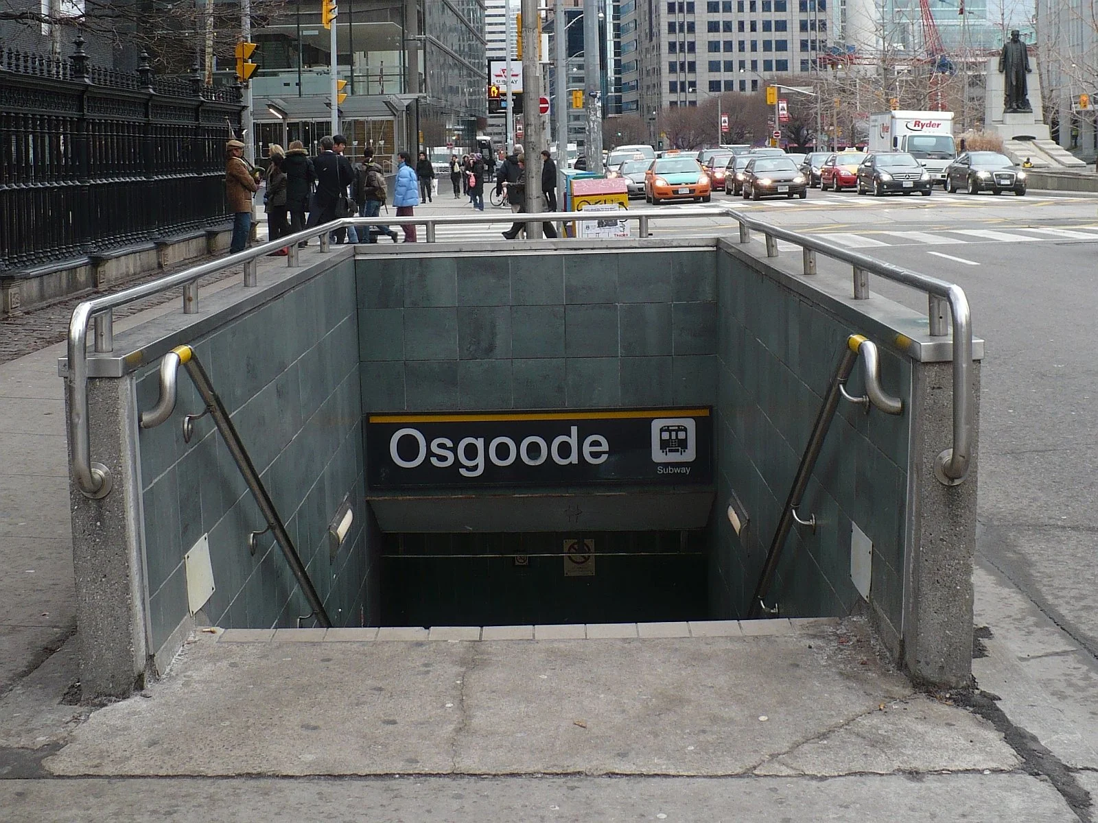
Current

New
Results + Next Steps
The new colours and the eye-catching design allows users to associate identifiable brand colours on their daily commute. This makes navigating the traffic of union station and little bit more bearable. There are still more enhancements to be made and see how successful this design could be outside of Toronto, with other regional transit systems.