Music never looked so good.
Optimizing aesthetics and functionality to provide a user centric experience with a redeveloped Apple Music app.
UI/UX Design
Timeline: Jan - March 2023
Sector: Technology
Tools Used: Adobe XD

Goal.
The Apple Music v Spotify debate has only grown ever since music streaming became the primary method of consuming music. Users of both services feel strongly about their choice and are usually against making the switch to the other. My primary goal is to create an app that picks up elements from each and (hopefully) satisfies the users of both services. Ultimately creating an app that would focus on the essential features that users value.
This project is to create an app that allows users to get to their music in the least amount of clicks and supports discovery, and self organization of music in a seamless and clean design.
Research.
For my research, I subscribed to both these services for a month, extensively using them for my day to day music consumption. I also interviewed my friends who use different services about the features they liked, and what is stopping them from switching to the other.
Here is a summary of the things I liked about each service.
Simpler navigation menu
Better recommendations
Better use screen space
Connectivity across devices (Spotify Connect)
Podcasts
Spotify
Visually appealing
Better implementation of karaoke and lyrics features
Music Videos
Integration with the Apple ecosystem
Radio
Apple Music
Implementation + Design.
Even though it is (probably) impossible to create the perfect music app, I tried to incorporate as many sections from each app as I could. Given that the consensus was Apple Music is the more visually appealing app, and it is more in line with the iOS design language, so, I decided to use the Apple Music UI style as the template.
The first step was simplifying the navigation menu at the bottom. The following are the navigation options on each app.
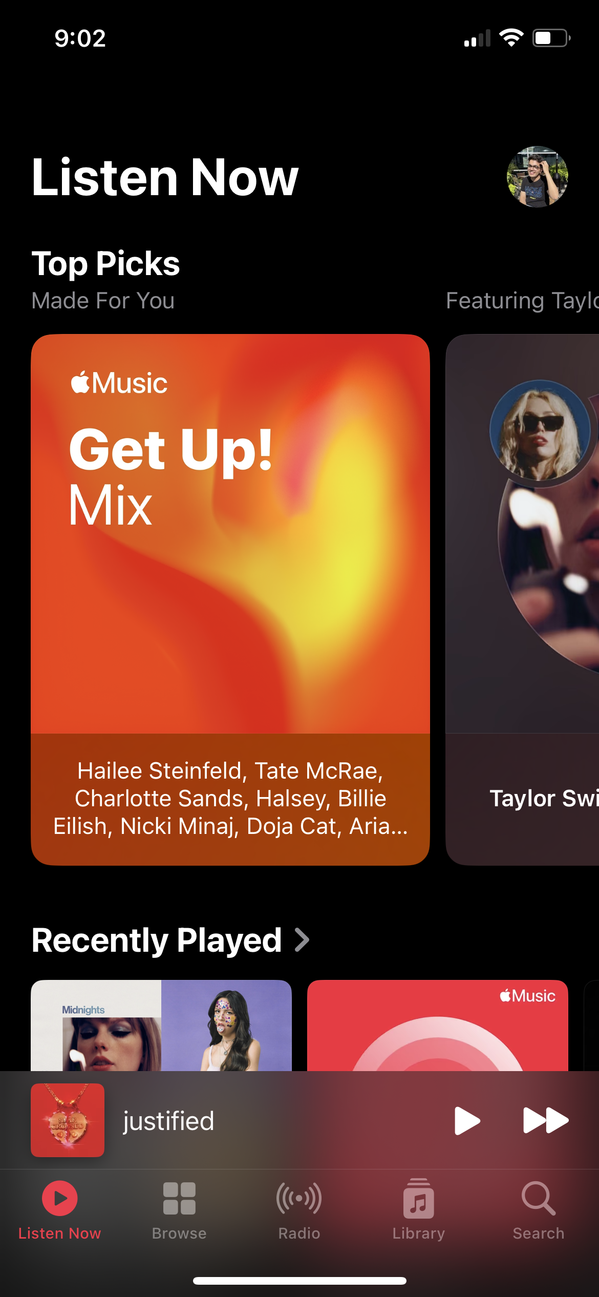
Apple Music - Listen Now, Browse, Radio, Library, Search
Spotify - Home, Search, Library
For the new app, I decided to go with three section - Listen Now, Search, and Library

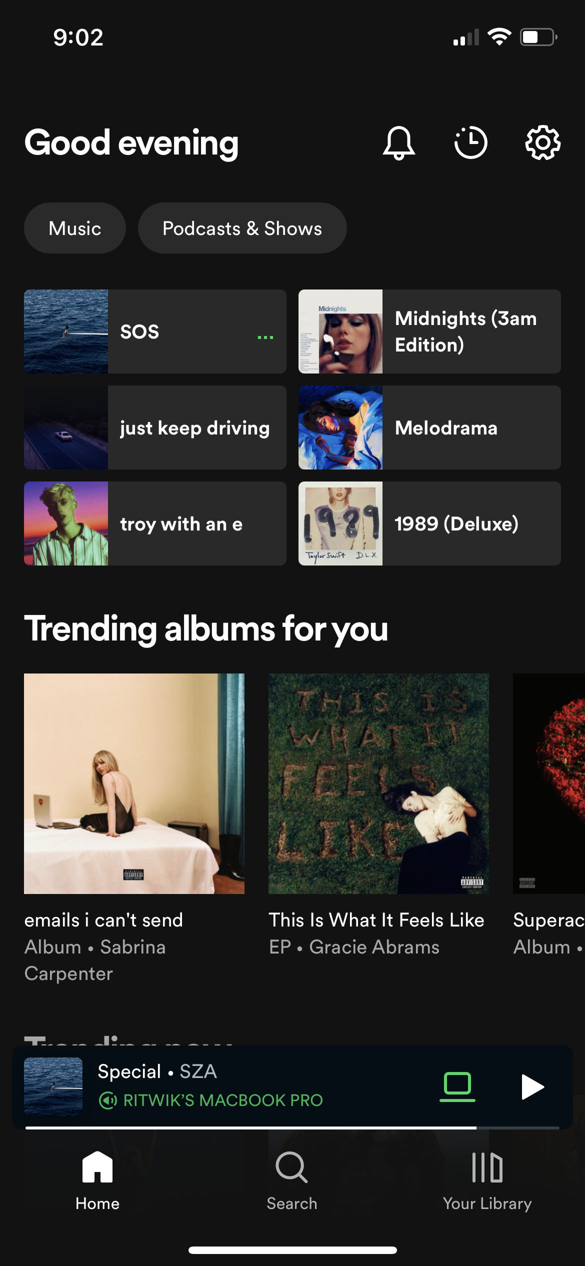
Listen Now.

The main page of the app should prioritize returning to your music, or discovering new music in the least amount of taps possible. The new listen now page is meant to do exactly this, with targeted recommendations, and highly intelligent suggestions.
Hero - This section features one special recommendation like new releases from your favourite artists, releases that are popular with audiences who have similar tastes as you, and going back to a release you loved but haven’t visited in a while.
Dive Right In - A quick access section to get back to the music you have been listening to in the past week, and altered depending on the time of the day and your activity at those times.

Recently Played - A section with your very recently played albums and playlists, so you don’t have to go looking for something you already like.
Music Videos - This section features new and popular music videos for songs you already love.
Radio - A list of Apple radio stations and your other regional favourites.
Search Page.

The main search bar allows you to type any artist, album, song, playlists, mood, environment, lyrics and shows you a list of results catered to you, suggesting songs, artists and albums that align with your listening history and preferred genres. For example, you search Love, and you are more of a country music person - you would see songs about love from country artists over songs by pop or hip hop artists.
Frequently Searched - An extra section that shows your most commonly searched for artists and releases. This section expands when you tap on the search bar.
Categories - All music is sorted into categories and genres that allows for simplified discovery and these categories can keep on expanding and increasing depending on how much you use the app.
Library Page.

This page was focussed on cutting down the clutter by organizing the Library section by the most commonly accessed sections - Playlists, Albums, Songs and Artists. Giving users a simplified library that didn’t mix the four sections together, or hid them behind a text based menu. This approach reduces clicking and feeling overwhelmed when you are just looking for the next song to play.
The top bar also adds two more Library focussed features - downloads and search. Downloads adds a filter on your library that just shows you the songs in your library that are downloaded onto your device, making it easier to play a song that won’t effect your data overages. Search gives you a focussed search that allows you to just search in your library pool, removing any suggestions from the app’s algorithm and the vast amount of songs available on the service.
Artist Page.


The artist page is one of the most important place for content discovery, and it is vital that the app organizes the content in the most efficient way, displaying the most amount of content in the least amount of space. Featuring big main pictures, with an easily accessible play button that automatically queues the artist’s popular tracks.
Latest Release - This section puts an artist’s most recent release front and centre, giving the new track a spotlight to shine - for fans and new listeners. Accompanied with a quick play button and an ‘add to library’ button.
Popular - This section lists the most popular tracks the by the artist, putting the trending tracks depending on the interest they are spiking in the last few weeks. Considering a lot of music discovery is happening through social media platform like TikTok, it is very useful for new fans to discover a song they saw in a video online.
Albums, Singles, and EPs - A simple arrangement of all the releases by the artist, sorted into Albums, Singles and Extended Plays, effectively demonstrating their complete discography.
Album/Song Page.


I also redesigned the final page you see before you play your choice of music, giving the cover art the complete top half of the screen, and putting the play button and the add button next to the cover art for quick access.
Now Playing
I decided to keep most of the original now playing page, but add more features to streamline the user experience by adding Lyrics, Karaoke, Airplay, Music Video, and Queue options. Incorporating all options in one place, making everything accessible at a glance, including music videos built right into the player.
Now Playing

Lyrics

Karaoke

AirPlay

Queue

Music Video

Conclusion and Next Steps.
I believe this design simplified multiple elements of a music app, while adding essential features that improve and organize the user experience. When presented to the initial people I consulted with, many Apple Music users mentioned it feels like an improved version of the app and gave them more efficient navigation. The original Spotify users mentioned a departure in the design they were used to, but enjoyed the more iOS aesthetic of the app and were happy that the features they value were present.
I strong feel no app is ever perfect, we are constantly in a state of flux, the users needs keep changing and you have to continuously grow (and innovate) to deliver on those needs, and sometimes you need to show them a new feature that they didn’t know they needed but will grow to love. This app can grow further to incorporate feature density, and improve the now playing experience.